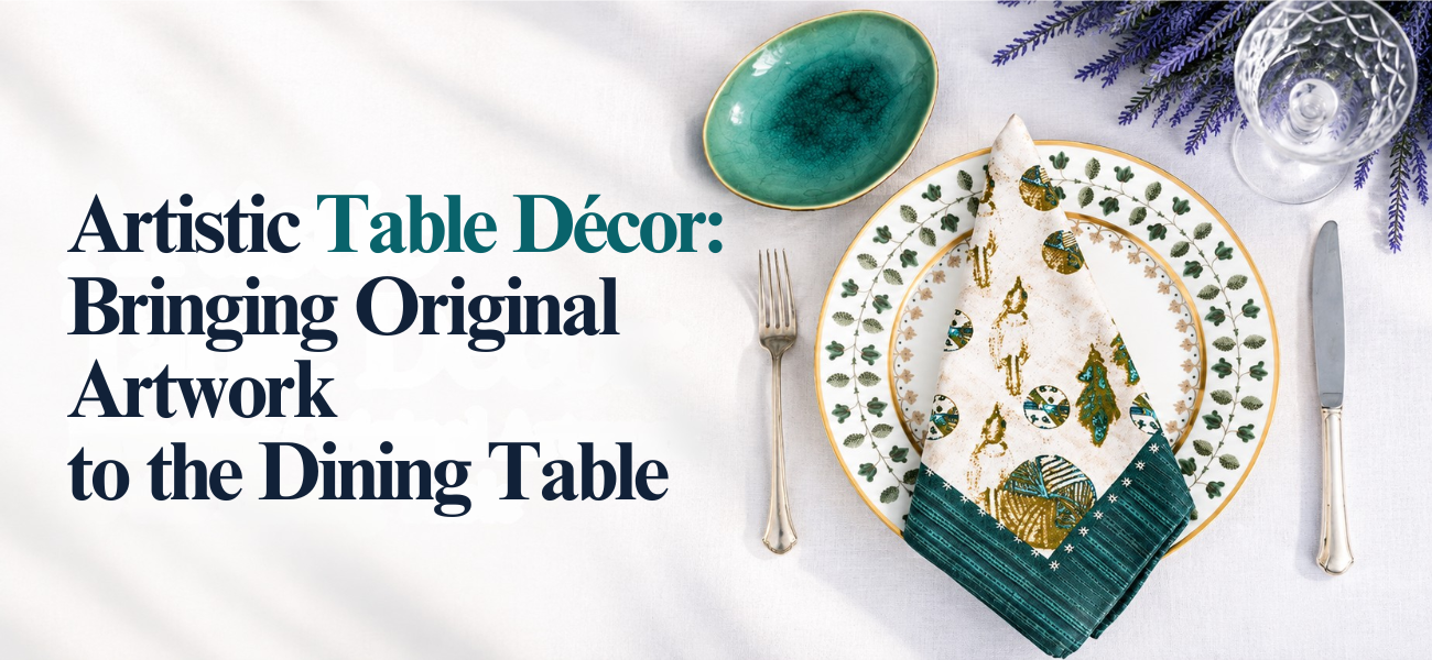
A dining table does a lot of work. It holds homework, mail and weeknight takeout, and a few times a year it holds a holiday meal that people remember. Most of the time we think of it as furniture. It can also be a canvas.
Look at the painting nearest your dining table. It already sets a tone for the room through its colors, its shapes and the mood it gives off. Artistic table décor takes that visual language off the wall and lets it shape what happens on the table: the linens you lay down, the flowers you choose, the color of a napkin or a glass.
This approach doesn’t require a formal dining room or expensive tableware. It asks you to look closely at art you love and let it guide a few thoughtful choices. The result is a table that feels connected to the room around it, and meals that feel a little more intentional, whether it’s a Tuesday dinner or a birthday celebration.
Original artwork can be incorporated into table décor by using it as the source of the table’s color palette, patterns, textures and mood. Pull one or two colors from the painting into linens, napkins or flowers, echo its shapes in the centerpiece, and match its overall feeling, calm or bold, in how full or spare the table looks.
Artistic table décor is a way of styling a dining table so it reflects an artistic point of view, often one taken from a specific artwork. The table becomes a composition, with colors, shapes and textures chosen to work together.
It can draw on art-inspired colors, artistic patterns, designer or artistic table linens, original artwork displayed nearby, creative centerpieces, considered place settings and a few decorative objects.
It doesn’t mean turning the table into a gallery installation. People still need room for plates and serving dishes. The goal is a setting where art and function support each other.
Before styling anything, study the artwork for four things.
Choose one or two colors that stand out in the painting. These can appear in napkins, a tablecloth, flowers, dinnerware or glassware. You don’t need every color. A painting with deep blue, ochre and a little coral might become a table with blue napkins and a single coral bloom in a small vase.
Notice the visual movement. Is the painting full of curves, sharp angles, horizontal bands or scattered forms? Flowing lines suggest round plates and trailing greenery. Strong verticals suggest tall taper candles.
Every artwork carries a mood: calm, warm, dramatic, playful, sophisticated or organic. A quiet watercolor calls for a spare table with plenty of open linen. A dramatic, high-contrast canvas can handle darker napkins and taller candles. Let the mood decide how full the table looks.
If the artwork has a recognizable pattern, such as repeated leaves, dots or brushstrokes, echo it subtly. A patterned napkin or a runner with a related motif is enough. The aim is a conversation between the painting and the table, not an exact match.
What to do: Pick one dominant color from the artwork and one or two supporting tones.
Why it works: A palette borrowed from the room ties the table to its surroundings.
Example: A landscape with sage fields and a pale pink sky becomes a table with sage napkins, white plates and a few pale pink roses.
What to do: Start with a runner, tablecloth or placemats that carry an artistic design, then build everything else around them.
Why it works: Linens cover the most surface, so they set the direction before anything else arrives.
Example: A cloth runner from Sara Anderson’s home goods collection, drawn from her artwork, can anchor a table on its own under simple white dishes.
What to do: Choose flowers, branches or greenery that relate to the artwork’s subject or colors.
Why it works: Natural elements add texture and change easily with the seasons.
Example: A still life with lemons might inspire a shallow bowl of real lemons and a few sprigs of olive or eucalyptus.
What to do: Take one color from the artwork and repeat it at every place, through a napkin, a glass or a small plate.
Why it works: Repeating one note at each seat creates rhythm without matching everything.
Example: A painting with a strong cobalt accent becomes a cobalt water glass at each setting, with everything else kept neutral.
What to do: Pair the artwork with a color that sits opposite or apart from its main tones.
Why it works: Contrast keeps the room from feeling flat and makes both painting and table stand out.
Example: A cool blue abstract on the wall pairs with rust or terracotta napkins on a natural linen runner.
What to do: Build one centerpiece that relates to the artwork in color, shape or subject, and keep it low enough for conversation.
Why it works: One focal point on the table answers the painting without competing with it.
Example: A painting of wild meadow flowers suggests a long, low arrangement of loose garden flowers running down the center of the table.
What to do: Use napkins, candles, serving pieces or salt cellars to carry small echoes of the artwork.
Why it works: Small details reward a closer look without redoing the whole table.
Example: Artistic napkins such as Sara Anderson’s Byzantine napkins bring a painted pattern to each seat, paired with plain candles in a color taken from the design.
Think of the relationship as three parts: the artwork, the linens and the dining space around them. The linens connect the other two.
A few factors guide the choice:
Here is a practical process that works in real homes.
The most elegant tables often have less on them than you’d expect. Restraint is what makes art-inspired styling look considered rather than themed.
Elegance usually comes from editing. When the table feels busy, take one thing away before adding anything new.
Artistic table décor isn’t only for holidays, dinner parties or formal events. The meals you eat most often are where these small choices matter most.
Simple everyday ideas:
Each takes less than a minute, and together they make an ordinary meal feel chosen rather than rushed.
For bigger occasions, you can make the table more expressive while keeping it practical.
In every case, keep sightlines open and leave room for food.
How can you bring fine art into everyday dining? Display original artwork where you can see it from the table, then let its colors and patterns inform your linens, dishes and flowers. Artistic textiles, carefully chosen objects and a thoughtful arrangement all extend the experience of art beyond the frame.
Fine art can shape a dining space through:
This is where original art for home décor becomes part of daily life rather than something you only notice when guests arrive. Sara Anderson’s work is a good example of this idea: her original artwork, ranging from lively paintings to intricate sketches, appears across scarves, robes, loungewear, accessories and home goods, including pieces for the table. You can explore her original works alongside the pieces they inspired.
A cohesive dining room connects the artwork, table, chairs, wall color, textiles, lighting and objects. Don’t try to match every element. Instead, create relationships through:
Warm, low lighting from candles or a dimmed pendant helps the artwork and table read as one scene.
| Styling Approach | Best For | Visual Effect |
|---|---|---|
| Artwork-inspired colors | Everyday dining | Cohesive |
| Bold artistic linens | Statement tables | Expressive |
| Neutral linens with colorful artwork | Busy artwork | Balanced |
| Coordinated tableware | Formal settings | Refined |
| Natural elements | Casual settings | Organic |
| Minimal décor | Modern interiors | Clean |
Before styling the table, ask:
Original artwork doesn’t have to stay on the wall. Its colors, shapes and mood can travel to the table through the linens you choose, the flowers you bring home and the small details at each place. Artistic table décor is less about owning special pieces and more about paying attention to the art you already love.
If you’d like to bring painted designs to your own table, explore Sara Anderson’s home goods, including runners and napkins drawn from her original artwork, or browse her collections to see how her paintings take shape across the home.